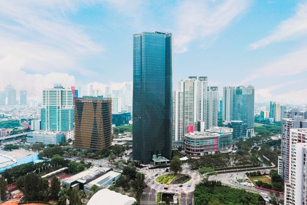
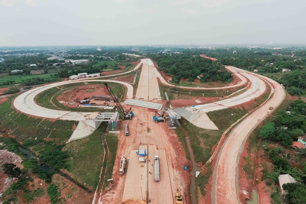
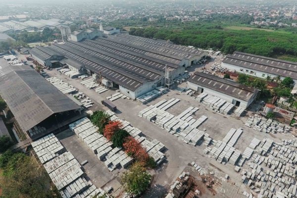
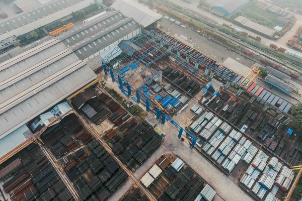
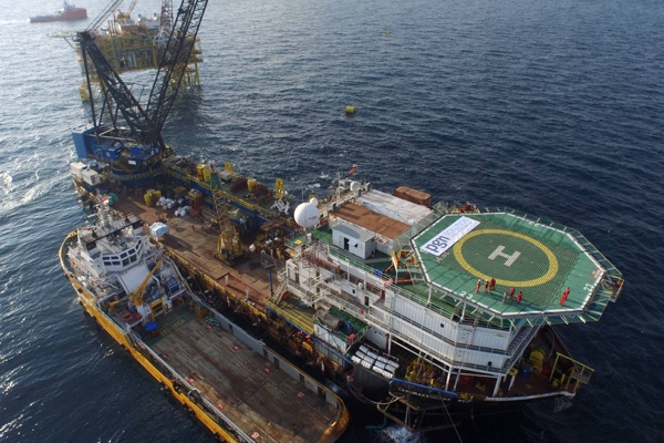
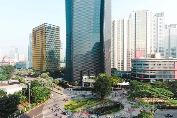
This is a list of 40+ available content elements that can be placed on the working canvas or inside of the columns. Think of them as bricks. With those bricks, you are building your layout. Most of the content elements have options to set them click pencil icon. To save changes click save button.

Row #

“Row“ is the main content element of WPBakery Page Builder  . Rows are used to divide your page into the logic blocks with columns, columns later will hold your content blocks. Rows can be divided into the layouts (eg. 1/2 + 1/2, 1/3 + 1/3 + 1/3, and so on). Your page can have an unlimited number of rows.   To change row’s position, click and drag row’s drag handler (top left row’s corner) and drag row around (vertical axis).

Param nameDescription
Row stretchSelect stretching options for row and content (Note: stretched may not work properly if parent container has “overflow: hidden” CSS property).
Column gapSet gap between columns, all columns within row will be affected by this value.
Full height rowSet row to be full height.
Note: if content will exceed screen size then row will be bigger than screen height as well.
Columns positionSet columns position for full height row – Top, Middle, Bottom.
Note: active only if “Full height row” is selected.
Equal heightSet all columns to be equal height.
Note: all columns will have same height as longest column.
Content positionSet content position within columns – Default, Top, Middle, Bottom.
Note: Default value will be used top or other if defined within theme.
Use video backgroundSet YouTube background for row.
YouTube linkEnter link to YouTube video to set it as row background.
Note: YouTube video will overwrite background images and can be used with parallax effect.
ParallaxAdd parallax type background for row (Note: If no image is specified, parallax will use background image from Design Options).
ImageSelect image from media library for parallax.
Note: active only if “Parallax” effect is chosen.
Parallax speedControl parallax effect speed with 1.5 value set as default. For traditional parallax effect 1.0 is the minimum value.
Note: active only if Image or Video parallax effect is enabled.
Row IDEnter row ID (Note: make sure it is unique and valid according to w3c specification).
CSS AnimationAdd animation to your element.
Extra class nameAdd class name in order to refer to this element in CSS.
Design OptionsControl borders, background and other styling options.

Important: Row allows you build complex layouts by inserting inner row within root level row/column. Take into account that it is not allowed to insert inner row within inner row.

Column #

“Columns“ are part of the row and they hold your content elements inside them. Columns can be reordered. Click and drag column around (horizontal axis). That way you can group elements in logical groups and then drag them around with your mouse (to re-position).

Param nameDescription
Use video backgroundSet YouTube background for row.
YouTube linkEnter link to YouTube video to set it as row background.
Note: YouTube video will overwrite background images and can be used with parallax effect.
ParallaxAdd parallax type background for row (Note: If no image is specified, parallax will use background image from Design Options).
ImageSelect image from media library for parallax.
Note: active only if “Parallax” effect is chosen.
Parallax speedControl parallax effect speed with 1.5 value set as default. For traditional parallax effect 1.0 is the minimum value.
Note: active only if Image or Video parallax effect is enabled.
Element IDAdd unique element ID (Note: make sure it is unique and valid according to w3c specification).
Extra class nameAdd class name in order to refer to this element in CSS.
Design OptionsControl borders, background and other styling options.
Width & ResponsivenessControl width, offset and visibility of element on different devices.

Section #

“Section“ is root type container element that allows you to ‘group’ several rows. You can insert section into root canvas only (section element can not be inserted into any other element, including row). Section element can contain only row elements.

Param nameDescription
Section stretchAdd class name in order to refer to this element in CSS.
Full height section?Set section to be full height.
Note: if content will exceed screen size then row will be bigger than screen height as well.
Content positionSet content position within columns – Default, Top, Middle, Bottom.
Note: Default value will be used top or other if defined within theme.
Use video background?Set YouTube background for section.
YouTube linkEnter link to YouTube video to set it as section background.
Note: YouTube video will overwrite background images and can be used with parallax effect.
ParallaxAdd parallax type background for section (Note: If no image is specified, parallax will use background image from Design Options).
ImageSelect image from media library for parallax.
Note: active only if “Parallax” effect is chosen.
Parallax speedControl parallax effect speed with 1.5 value set as default. For traditional parallax effect 1.0 is the minimum value.
Note: active only if Image or Video parallax effect is enabled.
CSS AnimationAdd animation to your element.
Section IDEnter section ID (Note: make sure it is unique and valid according to w3c specification).
Disable sectionAllows you to disable section (It will not be visible to the public).
Extra class nameAdd class name in order to refer to this element in CSS.
Design OptionsControl borders, background and other styling options.

Text Block #

“Text block“ allows you to insert paragraph type text and format it using WYSIWYG editor. Moreover text block allows adding media(images and videos).

Param nameDescription
TextAdd/Edit content using WYSIWYG editor TinyMCE.
CSS animationsAdd animation to your element.
Element IDAdd unique element ID (Note: make sure it is unique and valid according to w3c specification).
Extra class nameAdd class name in order to refer to this element in CSS.
Design OptionsControl borders, background and other styling options.

Separator #

“Separator“ add separator line to your page.

Param nameDescription
ColorChoose color of your separator line, including Custom color chosen with Color picker or defined as RGB code.
Separator alignmentSelect separator alignment.
StyleChoose line styling – solid, dotted, dashed, shadow etc.
BorderBorder width in pixels.
Element widthDefine line width within column in percents.
CSS AnimationAdd animation to your element.
Element IDAdd unique element ID (Note: make sure it is unique and valid according to w3c specification).
Extra class nameAdd class name in order to refer to this element in CSS.
Design OptionsControl borders, background and other styling options.

Separator with Text #

“Separator with Text“ add separator line to your page together with text which can be positioned in the centre, left or right sides of line.

Param nameDescription
TitleText which will appear on the line.
Add iconAdd icon to separator from Icon Library.
Title positionAllows positioning of your text in the centre, left or right side of the line.
Separator alignmentSelect separator alignment.
ColorChoose color of your separator line, including Custom color chosen with Color picker or defined as RGB code.
StyleChoose line styling – solid, dotted, dashed, shadow etc.
BorderBorder width in pixels.
Element widthDefine line width within column in percents.
CSS AnimationAdd animation to your element.
Element IDAdd unique element ID (Note: make sure it is unique and valid according to w3c specification).
Extra class nameAdd class name in order to refer to this element in CSS.
Design OptionsControl borders, background and other styling options.

ZigZag Separator #

“ZigZag separator“ add separator line in form of zig zag. It uses SVG graphics to form the line and can be positioned in the centre, left or right sides of line.

Param nameDescription
Separator alignmentSelect separator alignment.
ColorChoose color of your separator line, including Custom color chosen with Color picker or defined as RGB code.
Element widthDefine line width within column in percents.
Border widthBorder width size with “Medium” as default.
CSS AnimationAdd animation to your element.
Element IDAdd unique element ID (Note: make sure it is unique and valid according to w3c specification).
Extra class nameAdd class name in order to refer to this element in CSS.
Design OptionsControl borders, background and other styling options.

Message Box #

“Message Box“ add noticeable message to your website in order to show success, error, warning etc.

Param nameDescription
Message Box PresetsSelect predefined message box designs or choose “Custom” for custom styling.
StyleSelect message box style.
ShapeSelect message box shape.
ColorSelect message box color.
Icon librarySelect icon library.
IconSelect icon from library.
Message textAdd/Edit content using WYSIWYG editor TinyMCE
CSS animationAdd animation to your element.
Element IDAdd unique element ID (Note: make sure it is unique and valid according to w3c specification).
Extra class nameAdd class name in order to refer to this element in CSS.
Design OptionsControl borders, background and other styling options.

FAQ (Toggle) #

“FAQ“ add collapsible toggle to your page.

Param nameDescription
Toggle titleTitle of toggle which will be displayed near open/collapse button.
Toggle contentContent of toggle editable using WYSIWYG editor TinyMCE.
StyleToggle style.
ColorToggle icon color.
SizeToggle size.
Default stateAbility to set default state of toggle open or closed(collapsed).
Element IDEnter toggle ID (Note: make sure it is unique and valid according to w3c specification).
CSS animationAdd animation to your element.
Extra class nameAdd class name in order to refer to this element in CSS.
Design OptionsControl borders, background and other styling options.

Single Image #

Add simple image to your layout and style it. Add CSS animation or apply Design Options.

Param nameDescription
Widget titleTitle of element which will be displayed above widget.
Image sourceMedia Library for inserting images from Media Library;
External link for inserting link to image;
Featured image for using Featured image (if specified).
ImageSelect image from media library. You can also upload images using media library.
External linkEnter direct link to external image.
Note: available if “External link” is chosen in “Image source”.
CSS animationAdd animation to your element.
Image sizeSet size of your image. Set large, small etc. or set your own width x height in pixels.
Note: External images accept only pixel values.
Add captionAdd caption defined in Media Library.
CaptionInsert caption – available only for External images.
Image alignmentSet alignment of element within a column.
Image styleSet image style – choose from square, rounded, border etc.
OnClick actionSelect onclick action:NoneLink to large imageOpen prettyPhotoOpen custom linkZoom
Image linkEnter link for onclick event.
Note: available if “Open custom link” is chosen in “OnClick action”.
Design OptionsControl borders, background and other styling options.
Element IDAdd unique element ID (Note: make sure it is unique and valid according to w3c specification).
Extra class nameAdd class name in order to refer to this element in CSS.

Image Gallery #

Add responsive Image gallery. Choose your gallery type from Flex Slider, Nivo Slider or Image grid.

Param nameDescription
Widget titleTitle of element which will be displayed above widget.
Gallery typeSelect gallery type from Flex Slider, Nivo Slider or Image grid.
Auto rotate slidesSelect interval between auto-rotation of images or disable it.
Image sourceMedia Library for inserting images from Media Library;
External links for inserting link to image;
ImagesSelect images from media library. You can also upload images using media library.
External linksEnter direct link to external images.
Note: available if “External links” is chosen in “Image source”.
Image sizeSet size of your image. Set large, small etc. or set your own width x height in pixels.
Note: External images accept only pixel values.
OnClick actionSelect onclick action:NoneLink to large imageOpen prettyPhotoOpen custom link
Custom linksEnter links for onclick event.
Note: available if “Open custom link” is chosen in “OnClick action”.
CSS AnimationAdd animation to your element.
Design OptionsControl borders, background and other styling options.
Element IDAdd unique element ID (Note: make sure it is unique and valid according to w3c specification).
Extra class nameAdd class name in order to refer to this element in CSS.

Image Carousel #

Add fixed size animated image carousel.

Param nameDescription
Widget titleTitle of element which will be displayed above widget.
Auto rotate slidesSelect interval between auto-rotation of images or disable it.
ImagesSelect images from media library. You can also upload images using media library.
Image sizeSet size of your image. Set large, small etc. or set your own width x height in pixels.
On clickDefine action for onclick event if needed.
Slider modeSlides will be positioned horizontally (for horizontal swipes) or vertically (for vertical swipes).
Slider speedDuration of animation between slides (in ms).
Slides per viewSet numbers of slides you want to display at the same time on slider’s container for carousel mode. Supports also “auto” value, in this case it will fit slides depending on container’s width. “auto” mode isn’t compatible with loop mode.
Slider autoplayEnables autoplay mode.
Hide pagination controlIf YES pagination control will be removed.
Hide prev/next buttonsIf YES prev/next control will be removed.
Partial viewIf YES part of the next slide will be visible on the right side.
Slider loopEnables loop mode.
CSS AnimationAdd animation to your element.
Element IDAdd unique element ID (Note: make sure it is unique and valid according to w3c specification).
Extra class nameAdd class name in order to refer to this element in CSS.
Design OptionsControl borders, background and other styling options.

Tabs #

Tabs is a complex element which consists of inner section collections(tabs) and its structure is similar to row and column hierarchy. You can create as many inner sections within element as you wish and then place any type of content within.

Param nameDescription
Widget titleTitle of element which will be displayed above widget.
StyleSelect tabs display style.
ShapeSelect tabs shape.
ColorSelect tabs color.
Do not fill content areaDo not fill content area with color.
Note: content area of tab will be transparent.
SpacingSelect tabs spacing.
Note: space between tab titles.
GapSelect tabs gap.
Note: space between tab titles and content area.
AlignmentSelect tabs section title alignment.
AutoplaySelect auto rotate for tabs in seconds.
Note: disabled by default.
Active sectionEnter active section number.
Note: to have all sections closed on initial load enter non-existing number.
Pagination styleSelect pagination style.
Pagination colorSelect pagination color.
Note: available only if “Pagination style” is selected.
CSS AnimationAdd animation to your element.
Element IDAdd unique element ID (Note: make sure it is unique and valid according to w3c specification).
Extra class nameAdd class name in order to refer to this element in CSS.
Design OptionsControl borders, background and other styling options.

Tabs Section #

Tabs section is an instance of Tabs element and controls one specific tab/section. It is similar to principe row and column.

Param nameDescription
TitleEnter section title.
Note: you can leave it empty.
Section IDEnter section ID (Note: make sure it is unique and valid according to w3c specification).
Add iconAdd icon to button from icon library.
Extra class nameAdd class name in order to refer to this element in CSS.

Accordion #

Accordion is a complex element which consists of inner section collections and its structure is similar to row and column hierarchy. You can create as many inner sections within element as you wish and then place any type of content within.

Param nameDescription
Widget titleTitle of element which will be displayed above widget.
StyleSelect accordion display style.
ShapeSelect accordion shape.
ColorSelect accordion color.
Do not fill content areaDo not fill content area with color.
Note: content area of accordion will be transparent.
SpacingSelect accordion spacing.
Note: space between accordion sections, section titles and content area.
GapSelect accordion gap.
Note: space between accordion sections.
AlignmentSelect accordion section title alignment.
AutoplaySelect auto rotate for tabs in seconds.
Note: disabled by default.
Allow collapsible allAllow collapse all accordion sections.
IconSelect accordion navigation icon.
PositionSelect accordion navigation icon position.
Active sectionEnter active section number.
Note: to have all sections closed on initial load enter non-existing number.
CSS AnimationAdd animation to your element.
Element IDAdd unique element ID (Note: make sure it is unique and valid according to w3c specification).
Extra class nameAdd class name in order to refer to this element in CSS.
Design OptionsControl borders, background and other styling options.

Accordion Section #

Accordion section is an instance of Accordion element and controls one specific section. It is similar to principe row and column.

Param nameDescription
TitleEnter section title.
Note: you can leave it empty.
Section IDEnter section ID (Note: make sure it is unique and valid according to w3c specification).
Add iconAdd icon to button from icon library.
Extra class nameAdd class name in order to refer to this element in CSS.

Post Grid #

Add posts of your WordPress site in grid view. Choose posts type, build your own unique query and define what kind of information to display.

Param nameTabDescription
Data sourceGeneralSelect content type for your grid.
Narrow data sourceGeneralEnter categories, tags or custom taxonomies.
Total itemsGeneralSet max limit for items in grid or enter -1 to display all (limited to 1000).
Display StyleGeneralSelect display style for grid.
Show filterGeneralAppend filter to grid.
Grid elements per rowGeneralSelect number of single grid elements per row.
GapGeneralSelect gap between grid elements.
Include onlyGeneralAdd posts, pages, etc. by title.
Note: active only if “Data source” is set to “List of IDs”.
Custom queryGeneralBuild custom query according to WordPress Codex.
Note: active only if “Data source” is set to “Custom query”
Items per pageGeneralNumber of items to show per page.
Note: active only if “Display style” is set to “Load more button”, “Lazy loading” or “Paginator”.
Order byData settingsSelect order type. If “Meta value” or “Meta value Number” is chosen then meta key is required.
SortingData settingsSelect sorting order.
OffsetData settingsNumber of grid elements to displace or pass over.
ExcludeData settingsExclude posts, pages, etc. by title.
Grid element templateItem designSelect predefined grid element template.
Note: It is allowed to create new template or modify selected. Predefined templates will be cloned.
Filter byFilterSelect filter source.
StyleFilterSelect filter display style.
AlignmentFilterSelect filter alignment.
ColorFilterSelect filter color.
Filter sizeFilterSelect filter size.
Button TextLoad more buttonEnter text for “Load more” button.
Note: “Load more” will be used by default.
Button styleLoad more buttonSelect button style.
Button shapeLoad more buttonSelect button shape.
Button colorLoad more buttonSelect button color.
Button sizeLoad more buttonSelect button size.
Button alignmentLoad more buttonSelect button alignment.
Button iconLoad more buttonAdd icon to “Load more” button.
Arrows designPaginationSelect design for arrows.
Arrows positionPaginationArrows will be displayed inside or outside grid.
Note: active only if “Arrow design” is chosen.
Arrows colorPaginationSelect color for arrows.
Note: active only if “Arrow design” is chosen.
Pagination stylePaginationSelect pagination style.
Pagination colorPaginationSelect pagination color.
Note: active only if “Pagination style” is chosen.
Loop pages?PaginationAllow items to be repeated in infinite loop (carousel).
Autoplay delayPaginationEnter value in seconds. Set -1 to disable autoplay.
Animation InPaginationSelect “animation in” for page transition.
Animation OutPaginationSelect “animation out” for page transition.
Design OptionsControl borders, background and other styling options.

Masonry Post Grid #

Add posts of your WordPress site in masonry grid view. Choose posts type, build your own unique query and define what kind of information to display.

Param nameTabDescription
Data sourceGeneralSelect content type for your grid.
Narrow data sourceGeneralEnter categories, tags or custom taxonomies.
Total itemsGeneralSet max limit for items in grid or enter -1 to display all (limited to 1000).
Display StyleGeneralSelect display style for grid.
Show filterGeneralAppend filter to grid.
Grid elements per rowGeneralSelect number of single grid elements per row.
GapGeneralSelect gap between grid elements.
Include onlyGeneralAdd posts, pages, etc. by title.
Note: active only if “Data source” is set to “List of IDs”
Custom queryGeneralBuild custom query according to WordPress Codex.
Note: active only if “Data source” is set to “Custom query”
Items per pageGeneralNumber of items to show per page.
Note: active only if “Display style” is set to “Load more button”, “Lazy loading” or “Paginator”.
Order byData settingsSelect order type. If “Meta value” or “Meta value Number” is chosen then meta key is required.
SortingData settingsSelect sorting order.
OffsetData settingsNumber of grid elements to displace or pass over.
ExcludeData settingsExclude posts, pages, etc. by title.
Grid element templateItem designSelect predefined grid element template.
Note: It is allowed to create new template or modify selected. Predefined templates will be cloned.
Filter byFilterSelect filter source.
StyleFilterSelect filter display style.
AlignmentFilterSelect filter alignment.
ColorFilterSelect filter color.
Filter sizeFilterSelect filter size.
Button TextLoad more buttonEnter text for “Load more” button.
Note: “Load more” will be used by default.
Button styleLoad more buttonSelect button style.
Button shapeLoad more buttonSelect button shape.
Button colorLoad more buttonSelect button color.
Button sizeLoad more buttonSelect button size.
Button alignmentLoad more buttonSelect button alignment.
Button iconLoad more buttonAdd icon to “Load more” button.
Design OptionsControl borders, background and other styling options.

Button #

Add button with multiple color and styling options: Modern, Classic, Flat, Outline, 3D Custom, Outline custom.

Param nameDescription
TextText which will appear on the button.
URL (Link)Button link.
StyleSelect button display style.
ShapeSelect button shape.
ColorSelect color of the button.
Note: Available if “Style” is not “Custom”.
Background colorSelect color for background of the button with color picker.
Note: Available if “Style” is set to “Custom”.
Text colorSelect color for text on the button with color picker.
Note: Available if “Style” is set to “Custom”.
SizeSelect button display size.
AlignmentSelect button alignment.
Set full width button?Set button to full width within column.
Note: Available if “Alignment” is not “Inline”.
Add icon?Add icon to button from icon library. Control alignment of icon.
CSS AnimationAdd animation to your element.
Element IDAdd unique element ID (Note: make sure it is unique and valid according to w3c specification).
Extra class nameAdd class name in order to refer to this element in CSS.
Design OptionsControl borders, background and other styling options.

Call to Action #

Create call to action block with heading, text, button and control its styling.

Param nameDescription
HeadingEnter text for heading line.
SubheadingEnter text for subheading line.
Use Custom font for Heading?Adds option to set Custom font to Heading.
Use Custom font for Subheading?Adds option to set Custom font to Subheading.
Text alignmentSelect text alignment in “Call to Action” block.
ShapeSelect call to action shape.
StyleSelect call to action display style.
ColorSelect color of the Call to Action.
Note: Available if “Style” is not “Custom”.
Background colorSelect color for background with color picker.
Note: Available if “Style” is set to “Custom”.
Text colorSelect color for text with color picker.
Note: Available if “Style” is set to “Custom”.
TextAdd/Edit text of call to action block using WYSIWYG editor TinyMCE.
WidthSelect call to action width (percentage).
Add button?Add button to Call to Action. Control position, alignment, style, color etc.
Add icon?Add icon to Call to Action. Control position, alignment, background, color etc.
CSS animationAdd animation to your element.
Element IDAdd unique element ID (Note: make sure it is unique and valid according to w3c specification).
Extra class nameAdd class name in order to refer to this element in CSS.
Design OptionsControl borders, background and other styling options.

Video Player #

Insert video in your layout. Choose from multiple formats accepted by WordPress.

Param nameDescription
Widget titleTitle of widget which will be displayed above widget.
Video linkLink to the video. More about supported formats at WordPress codex page.
Video widthSelect video width in percentage. Percentage will be calculated from the size of container (column).
Video aspect ratioSelect aspect ratio of video with 16:9 set as default.
AlignmentControl alignment of video player within container (column).
CSS AnimationAdd animation to your element.
Element IDAdd unique element ID (Note: make sure it is unique and valid according to w3c specification).
Extra class nameAdd class name in order to refer to this element in CSS.
Design OptionsControl borders, background and other styling options.

Raw HTML #

Insert your custom HTML content if necessary

Param nameDescription
Raw HTMLEnter your HTML content.
Element IDAdd unique element ID (Note: make sure it is unique and valid according to w3c specification).
Extra class nameAdd class name in order to refer to this element in CSS.
Design OptionsControl borders, background and other styling options.

Raw JS #

Insert your custom JS code if necessary

Param nameDescription
Raw JSEnter your JS code.
Element IDAdd unique element ID (Note: make sure it is unique and valid according to w3c specification).
Extra class nameAdd class name in order to refer to this element in CSS.
Design OptionsControl borders, background and other styling options.

Empty Space

Insert empty space between elements with custom height.

Param nameDescription
HeightEnter empty space height.
Element IDAdd unique element ID (Note: make sure it is unique and valid according to w3c specification).
Extra class nameAdd class name in order to refer to this element in CSS.
Design OptionsControl borders, background and other styling options.

Custom Heading

Create custom heading with Google Fonts, choose one of predefined fonts and apply styling.Important: If you are using non-latin characters be sure to activate them under Settings/WPBakery Page Builder/General Settings.

Param nameDescription
TextEnter your content.
Element tagSelect element tag.
Note: H1 tag is available for Custom Heading starting from version 4.7.
Text alignSelect text alignment.
Font sizeSelect font size. By default the size defined by your theme for specific tag will be used.
Line heightSelect line height to set space between lines.
Text colorSelect color of your text.
Use font family from the themeSet font family of Custom Heading to theme default.
Note: This will disable Font Family and Font Style options.
Font FamilySelect Google Font family from predefined list.
Font styleSelect font styling available for chosen font family. For example light, normal, bold, italic, etc.
Google Fonts previewSee how you chosen Font Family and Font style looks like.
CSS AnimationAdd animation to your element.
Element IDAdd unique element ID (Note: make sure it is unique and valid according to w3c specification).
Extra class nameAdd class name in order to refer to this element in CSS.
Design OptionsControl borders, background and other styling options.

Icon Element

With WPBakery Page Builder you can easily add icons from following libraries: Font Awesome, Open icons, Typicons, Entype, Linecons

Param nameDescription
Icons sourceSelect icon source (Library).
IconSelect icon from chosen Icon source (Library).
ColorSelect color of your icon.
Note: Custom color is available.
Background styleSelect background style for your icon (default is ‘None’).
Background colorSelect color of icon’s background (only if Background style is chosen).
Note: Custom color is available.
SizeSelect icon size from Mini, Small, Medium, Large, Extra Large.
Icon alignmentSelect icon alignment.
URL (link)Icon link.
CSS animationAdd animation to your element.
Element IDAdd unique element ID (Note: make sure it is unique and valid according to w3c specification).
Extra class nameAdd class name in order to refer to this element in CSS.
Design OptionsControl borders, background and other styling options.

Default Widgets of WP #

With WPBakery Page Builder you can easily add all existing default WP widgets. All widgets are listed within WPBakery Page Builder element list.

Param nameDescription
Widget titleTitle of widget which will be displayed above widget.
Element IDAdd unique element ID (Note: make sure it is unique and valid according to w3c specification).
Extra class nameAdd class name in order to refer to this element in CSS.

Powered by BetterDocs